FANTAWILD HEADQUARTERS
HOSPITALITY, COMMERCIAL, CIVIC, CULTURAL
Client Fantawild
Location Shenzhen, China
Program 150m tall, 32 floor, office tower, exhibition, restaurant, garden, retail
Area 30,007 m² / 322,917 ft²
Status Competition, concept, finalist (of 57 teams)
Location Shenzhen, China
Program 150m tall, 32 floor, office tower, exhibition, restaurant, garden, retail
Area 30,007 m² / 322,917 ft²
Status Competition, concept, finalist (of 57 teams)
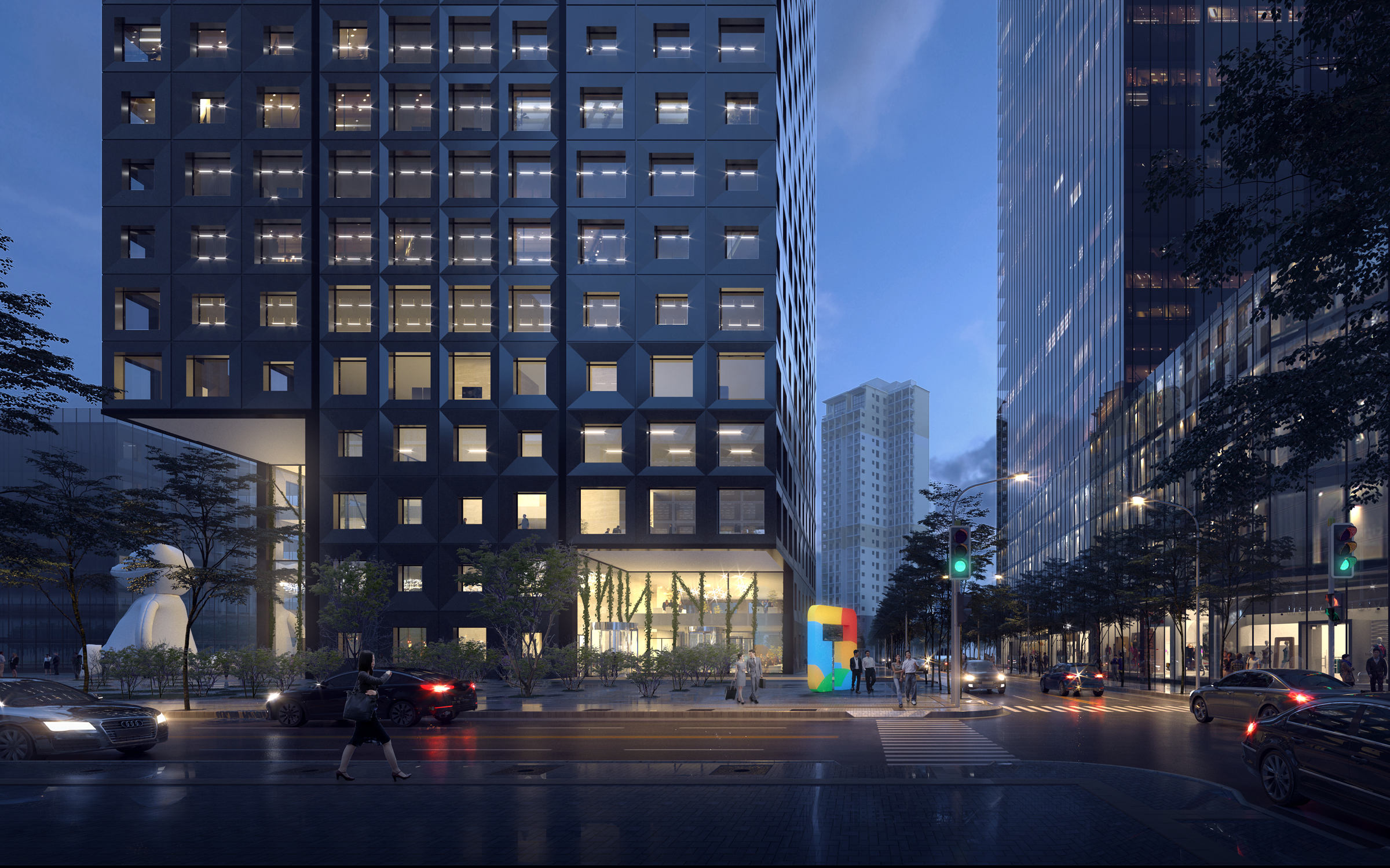
As China’s preeminent creators of children’s media and theme parks, Fantawild’s unique brand of fantasy and innovation translates into architectural form through a series of pixelating design operations applied to its structural cores, outdoor spaces, and exoskeleton. Evoking the myriad of connotations associated with the Chinese character ‘Fang’, this proposal turns to the fundamental element of digital animation—the pixel—for its generative logic.
THE ‘DISPERSED CORE’ STRATEGY
In plan, the tower emerges from a 9-square grid of 12x14m pixels, which breaks down the idea of a massive central core into a cruciform of four independent cores. This ‘dispersed core’ strategy diversifies possible floorplate configurations while independent elevator cores multiply the number of possible circulation experiences to meet the divergent needs of employees, guests, and VIPs.

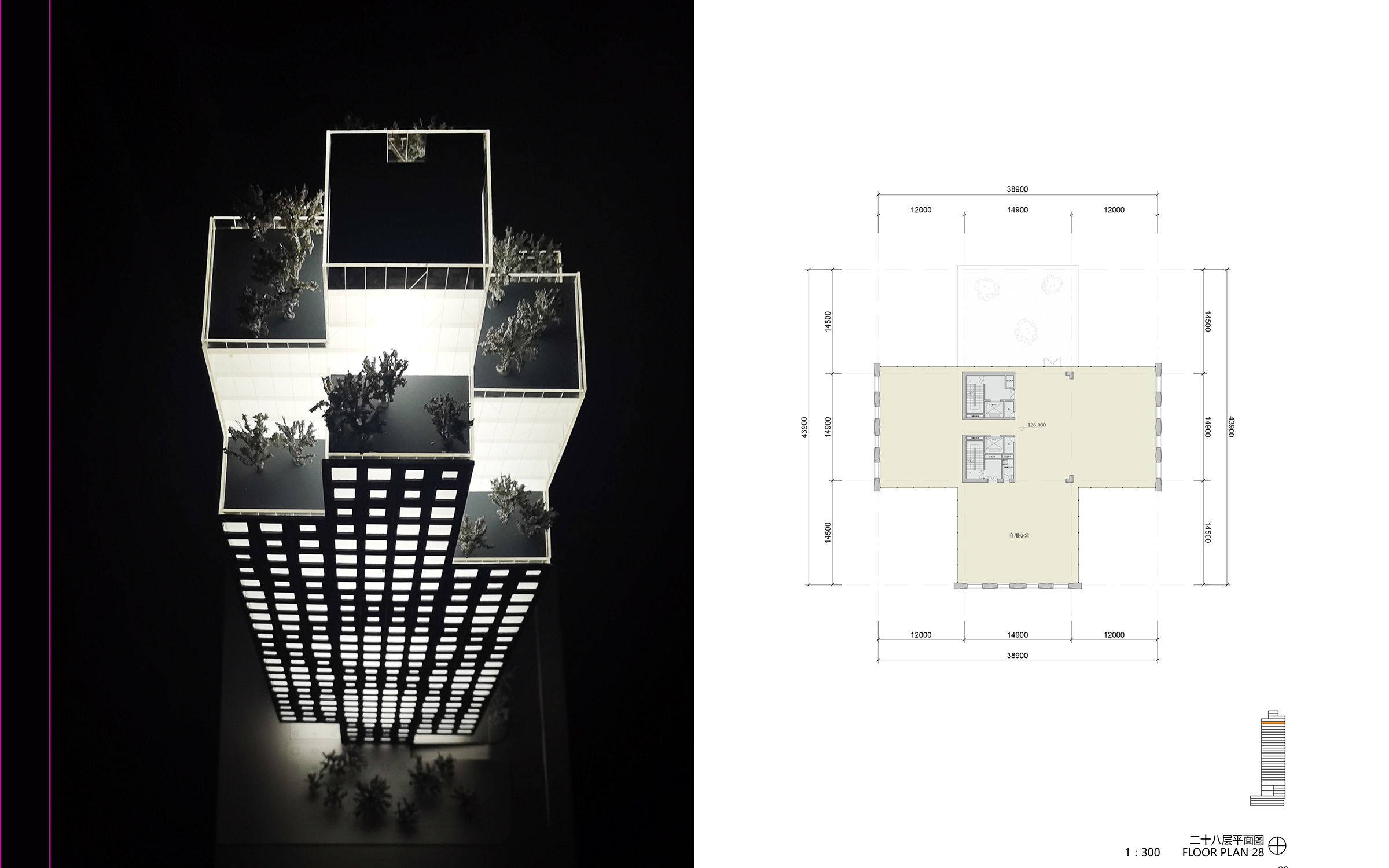
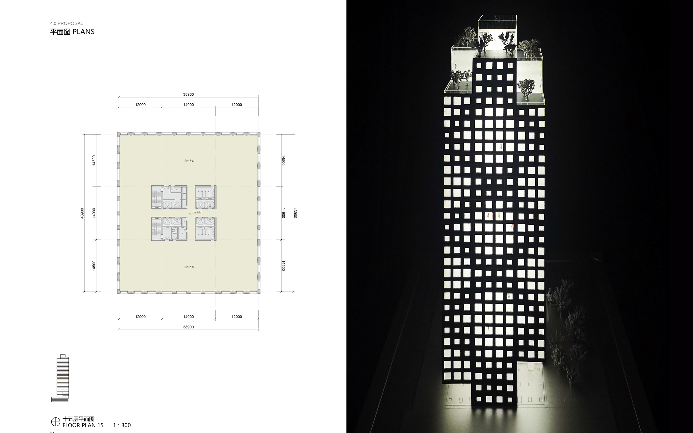
12X14M ‘PIXELS’ EXTRUDE INTO PRISMS
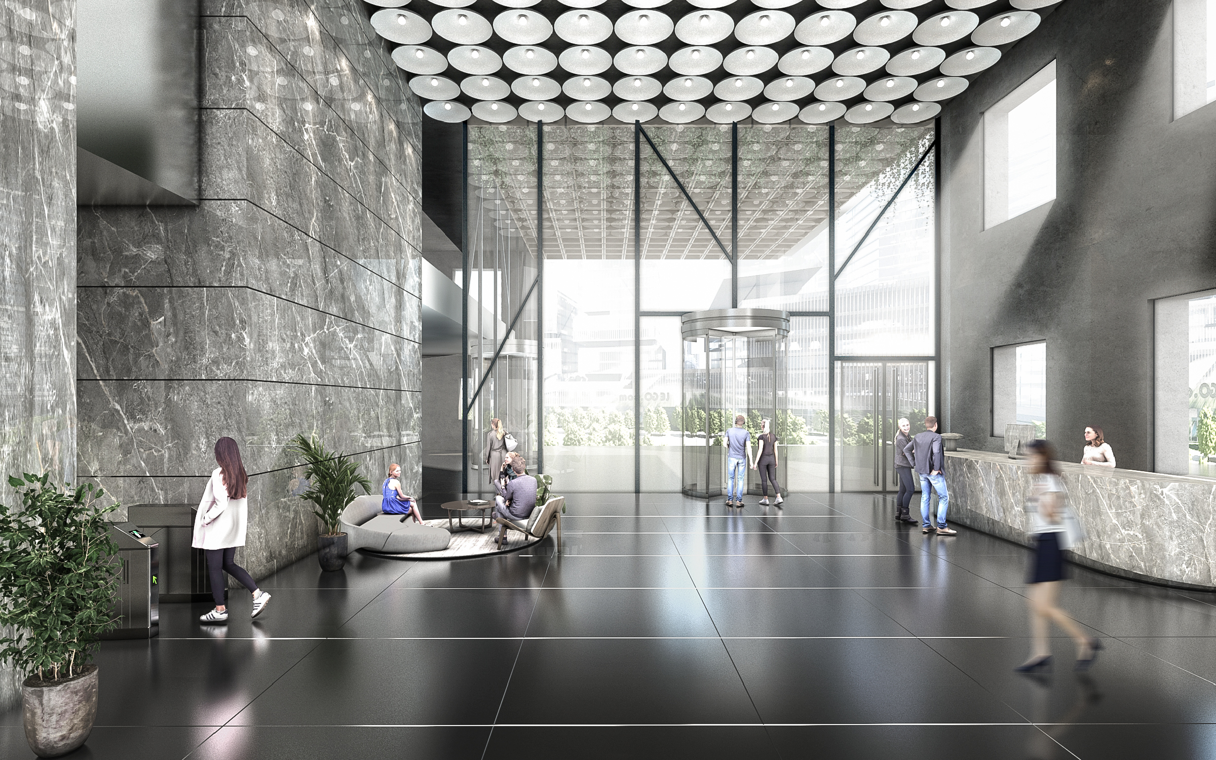
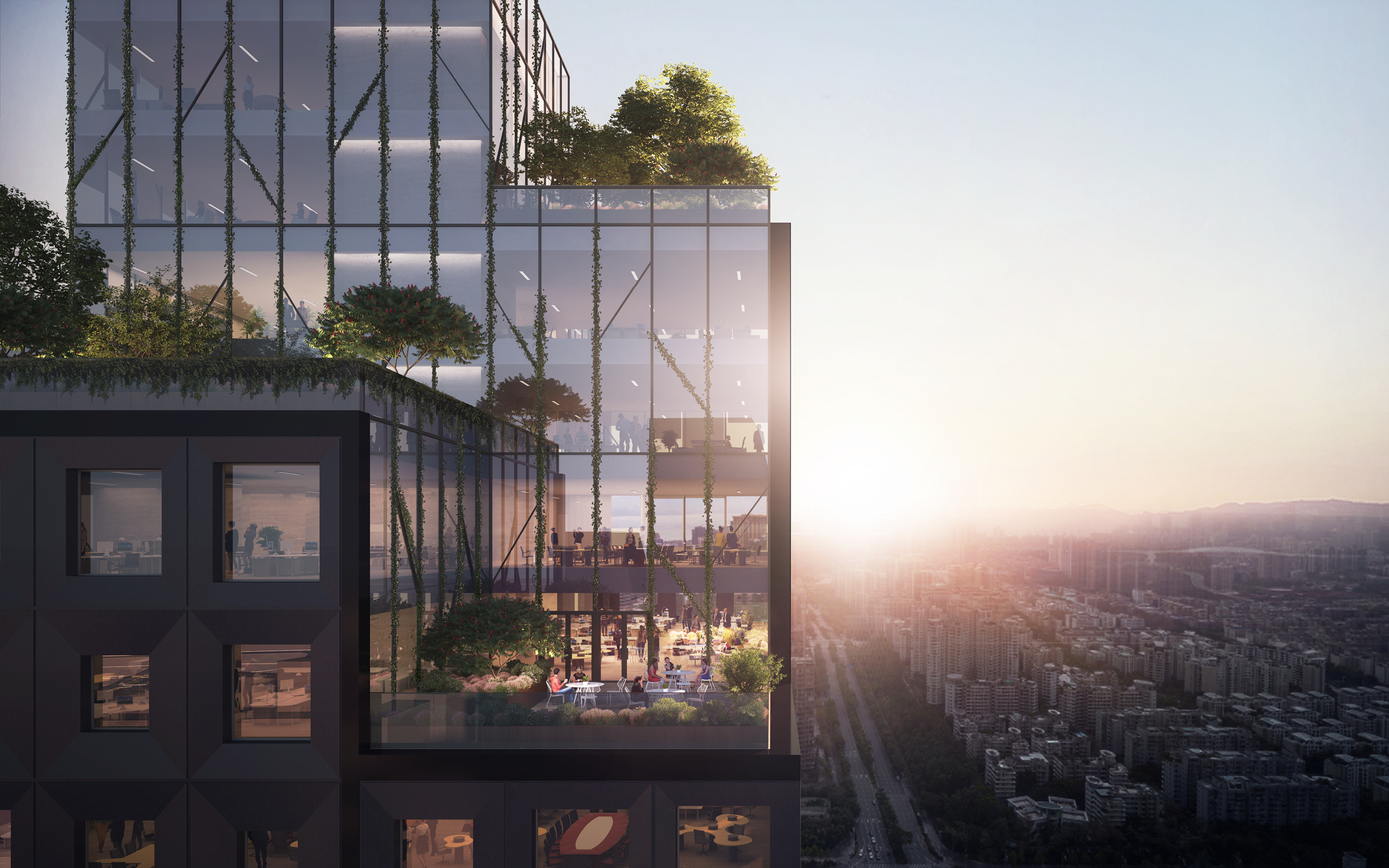
In elevation, the 12x14m ‘pixels’ extrude into prisms of varying heights, revealing a three-dimensional landscape of terraces and hanging gardens. Instead of a fortress-like podium, each corner at street level reveals an outdoor lobby sheltered beneath generous 14m cantilevers.
SCALE AND MASSING ARE BROKEN DOWN BY THE TIERED SETBACKS.
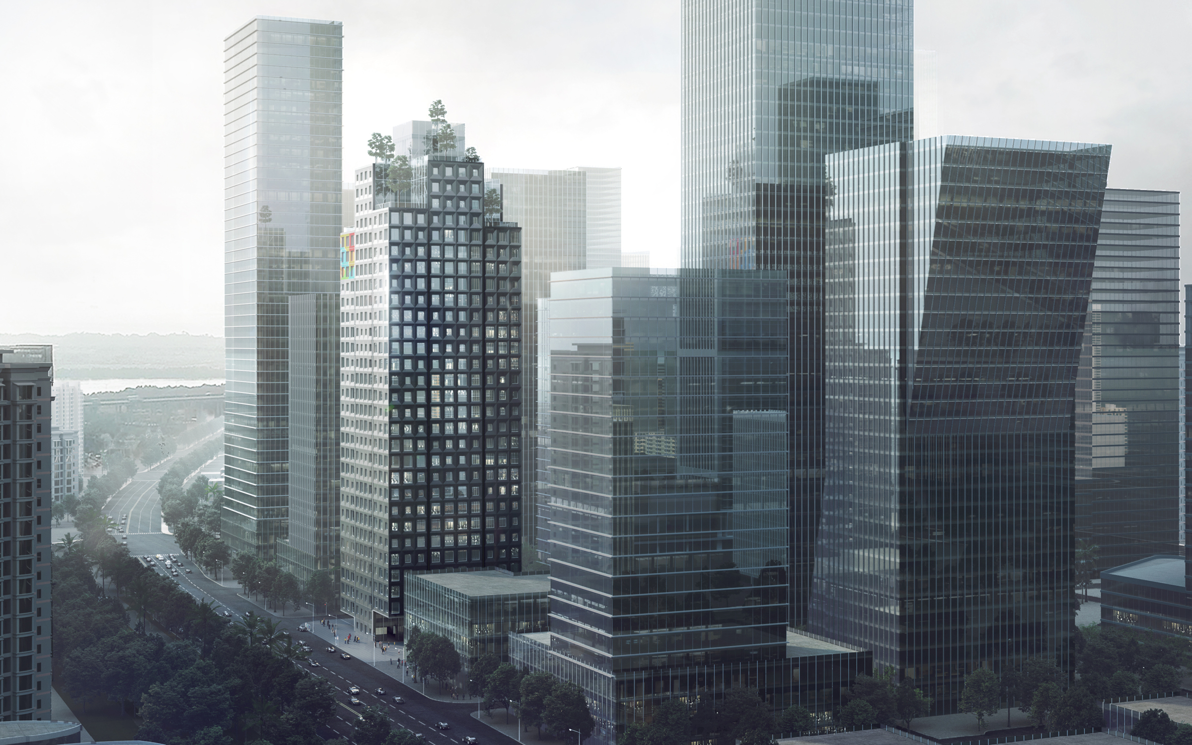
Above, the tiered setbacks break down the tower’s overall scale and massing and from afar, creating unique impressions of diversity and porosity within the greater urban fabric. Like a turret, the tapered silhouette evokes the fantasy of medieval castles, subtly interpreting Fantawild’s brand identity.

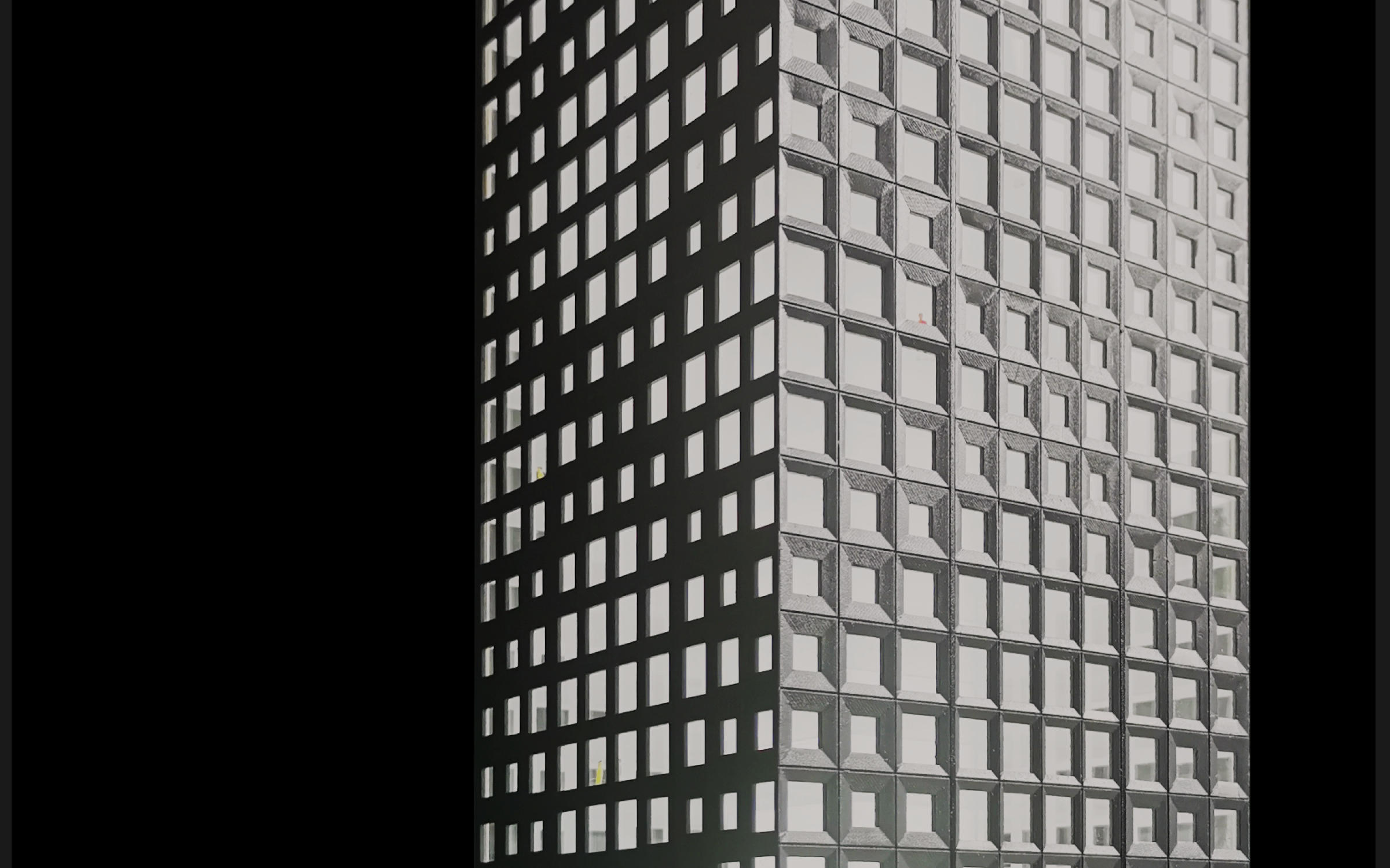
LIKE DIGITAL SCREENS, THE RESULTING ‘PIXELATED’ PATTERN OF THE FACADE GIVES THE IMPRESSION OF MOVEMENT TO A STATIC SURFACE, AND APPEARS TO SHIMMER.
By combining an orthogonal ‘Vierendeel truss’ with triangulated ‘cross-bracing’, we achieve the pros and avoid the cons associated with conventional ‘braced tube’ construction to provide column-free workspaces while at the same time eliminating awkward view obstructions typically associated with massive ‘X’-shaped perimeter beams.

Team
Andrew Heid, Junwei Li, Christopher Purpura, Zhangzheng Yang, Shunfan Zheng
Andrew Heid, Junwei Li, Christopher Purpura, Zhangzheng Yang, Shunfan Zheng
Collaborators
Pan Group GMS Engineers
Distinctions Finalist
Pan Group GMS Engineers
Distinctions Finalist
